How many photos are in a 24-page photo book?
Jesse / 8 August 2025
What a photo book page actually means
When people talk about a 20-page photo book, what does it mean? Some think it means 24 photos, but in fact there are many ways to use the page—some with many photos, others featuring just one.
The word “page” in printing doesn’t always mean what you’d expect. A page is one side of a sheet. If your book opens like a regular one, then 24 pages equals 12 physical sheets. That’s 12 on the left, 12 on the right. Each side counts as one page, even if it’s blank.
Difference between pages and sheets
A sheet is what’s printed and then folded or bound. Once printed on both sides, that sheet becomes two pages. So if your photo book is described as having 24 pages, you are actually working with 12 sheets.
This distinction matters because you can’t always split content exactly how you want across sheets. Some layouts require an image to spread over both sides, so one sheet might only hold a single image.
Why the photo count doesn’t equal page count
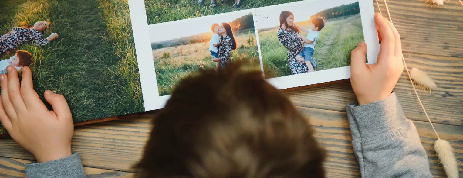
A 24-page book doesn’t mean you can place 24 photos, one on each page. You could fit far more, or much fewer, depending on layout and photo size. Some people want one strong image per page. Others want a collage or grid layout.
Some pages might carry one image while others may hold four or more. That alone means the total number of photos in the book could range from 15 to over 100. It all depends on the visual story you’re building. Good photobook companies will offer software that gives you many options for how to lay out your photos on each page—ranging from just one photo to many. Hopefully you’ll find a layout option that inspires you for the pictures you want to show and the story you want to tell.
The role of layout in photo count
Layout is the biggest factor in how many photos end up in the final version. A minimalist layout might use one image per spread, leaving lots of white space. On the other hand, a collage layout could display 6 to 9 smaller photos on a single side.
Templates vary depending on the software or design tool you use. If you’re doing photo book printing through an online photobook company, you will see an array of layouts on offer. They are often divided into how many pictures you want on your page and then offer a variety of layouts fitting that many pictures on the page. These layouts set the tone for how many photos will fit naturally.
Types of photo layouts people often use
Full-page layouts give every image a chance to stand out. They work best for portraits or dramatic shots. Grid layouts group images in neat rows and are often used for events where many images carry equal value. Mosaic layouts vary photo size across the page and work well for informal storytelling.
Each style has its pros and cons. Full-page layouts feel cleaner, but they limit photo quantity. Collage styles let you fit more but can start to feel crowded if not handled well.
How full-page photo layouts impact the total
Using full-page images means you’ll need 24 standout photos—one per page. That might sound simple, but not every photo works at full size. You need high resolution, clear composition, and consistency in lighting.
Using full-page layouts also adds a certain style to the book. It feels more like a coffee table book and less like a scrapbook. But be warned: if just one image is blurry or badly cropped, it stands out more in a full-page layout than it would in a collage.
Mixing text with images and how it changes the count
Sometimes you’ll want to add quotes, captions, or short titles. These elements take up space. If a page is used for text, you’re reducing the space available for photos. Some books even open with a title page or introduction.
A page with just a sentence or date marker can be a powerful design choice—but it means one fewer page for images. When planning, allow at least 1–2 pages for text or white space.
White space and margins: how design affects total photos
Many books use white space to help the photos breathe. Margins are not just there to look neat—they stop content from running into the fold or edges. But white space eats into your real estate.
If your design keeps a thick border around every image, you won’t be able to fit many photos per page. On the other hand, tight margins let you pack more in, but the result can look messy if not aligned well.
Standard photo sizes and how many fit per page
The most common photo sizes people upload are 4×6, 5×7, and square crops from social media. On an A4-sized book page, you could fit two 4×6 photos side by side with a decent margin. Go smaller, and four can fit comfortably. Add a caption and that drops to two or three.
If the photo book is smaller (say 20×20 cm), your options get more limited. Larger books allow more freedom, but then file resolution becomes more critical. Most photobook software should warn you if the resolution of your images is too small for good printing quality.
Popular styles: minimalist vs collage-heavy books
Minimalist photo books often have 20–30 photos in total across the 24 pages. They might even leave some pages blank to highlight one image on the next. These books feel sleek but require stronger image curation.
Collage-heavy photo books can easily reach over 100 photos, especially for family holidays or birthday parties. These books don’t aim for elegance—they aim to capture every moment. They work well for events but can feel busy if there’s no order.
How printing quality and photo density relate
High-quality printing works best when there’s breathing space. Too many photos per page can look cluttered and reduce the visual impact. If you’re doing photobook printing, think carefully about the visual impact of your pages. Featuring one photo on a page mixed with multiple photos on the next page can be a good way to fit in enough pictures while creating a strong visual impact.
Paper thickness and image placement
Thick paper is usually offered for a luxury feel for special albums like wedding albums. When you’re going for this luxury feel, picture spacing and giving your page breathing space adds to the effect. The binding on these types of pages often allows the picture to spill across the centre of the book, where there would usually be a gutter for the binding. Planning your pages in a way that features some big feature photos can give a dramatic, beautiful effect.
A heavier page with one centred image feels deliberate. Lightweight pages handle collage layouts better, especially when turning pages frequently.
Double-page spreads: do they count as one or two?
Double-page spreads give a dramatic, beautiful effect, highlight high-quality pictures and help with storytelling. They count as two pages in a printed hardcover book. A few things to remember: it’s important to choose the right photo and consider your book and page type. Remember, hardcover printed photobooks have a gutter in the middle of your book where the pages are bound. If you use standard (usually called silk) paper, the binding will “eat” up a bit of your photo—so the visual joins between the pages will not be exact. This can be improved by upgrading to layflat paper which still has binding in the centre, but it’s a lot less and the pages are set up so that the visual is cleaner across the spreads. The paper lays flat and gives a very nice effect. So choose your double-page spread picture carefully—you don’t want people or important subjects appearing in the middle of the page where the gutter will be.
For the page count, a double-page spread counts as two pages. One spread across both sides of a sheet is two pages used.
For higher-end books like a wedding album range, double-page spreads are much easier and more impactful as the binding is done in such a way that it doesn’t affect the spread. The picture flows seamlessly across the page, uninterrupted by the spine.
Portrait vs landscape format and photo arrangement
The layouts for portrait or landscape books are pretty dynamic and you should find a variety of options. Landscape books are a more common and favoured style—their layout is a little easier to use and lends itself to storytelling better. Portrait books suit vertical images slightly better than landscape but can still fit a small or large number of pictures, depending on your preference.
What people usually expect from 24 pages
It’s a common wonder: how many pictures do I need for a 24-page photobook? The expectations can range from 24 to hundreds. The good news is, the layout options are diverse enough to suit all tastes and styles. At the beginning of a project one often doesn’t know how many pictures they have, but as they shortlist their pictures and create their galleries, they can see they have over 100 images they want to include. A good estimate is that a 24-page photo book will usually include anywhere from 40 to 80 photos.
That’s assuming a mix of full-page, half-page, and grid layouts. If you use mostly collages, expect that number to hit 100. If you prefer minimalism, it may drop closer to 20 or 30.
How event type influences the number of photos
Weddings tend to have more full-page photos. There’s a focus on moments, not just quantity. You’ll see titles like “The Ceremony” or “First Dance,” and these often get a page to themselves.
Birthday parties, family holidays, or school albums go for volume. These often lean into collage layouts, trying to fit as many smiling faces as possible per spread.
Choosing quality vs quantity when selecting images
This is where most people get stuck. They have 300 photos and want to squeeze them into 24 pages. But you’re better off picking 60 good ones than 200 average ones.
Too many photos on a single page compete for attention. A well-chosen image in the right layout does more for memory and meaning than stuffing in everything. Pick your best, not your most.
Tips for narrowing down your photo selection
- Start with everything. Then filter down.
- Remove duplicates.
- Drop low-quality or blurry ones.
- Keep only images that add something unique.
- Look at your layout template and test how each batch fits. What works well in a folder doesn’t always feel right on paper—choose with the end product in mind.
Why photo book software sometimes suggests fewer photos
Design tools that offer photo book printing usually suggest limits for a reason. They’re built to balance spacing, margins, and layout logic. Ignoring those suggestions might cause image overlap or crowded designs.
Even if you upload 100 photos, the system may suggest you add more pages or reduce images per layout. That’s a built-in design safety net.
Creative tips to fill pages when you don’t have many images
Use quotes, short captions, or even coloured backgrounds to fill space. A simple sentence like “Holiday 2023” or “The Best Day Ever” gives emotional weight. You can also include non-photo elements like tickets, location maps, or doodles.
Pages with just a few key visuals can look stylish and still feel complete.
How people sometimes add non-photo elements
Some people drop in a shot of handwritten notes or screenshots of text messages. These make the book more personal. Travel books often include maps or routes. These non-photo pages slow the pace and add a nice touch.
This is where Canvas and Wall Arts or collage tools come in handy—you’re not just adding photos, but building visual context.
What to avoid when trying to fit in too many photos
Don’t shrink your images too much. A photo that’s too small to see clearly adds nothing. Also avoid the temptation to use every photo from your gallery. If it doesn’t fit naturally, leave it out.
Busy pages tire the eyes and ruin flow. Keep the rhythm going by mixing layouts and giving the viewer time to pause.
Why it’s okay if not every page has lots of images
Not every page needs to be filled. Some pages are better left light. It allows the stronger images to shine. It also helps the pacing. A book that’s too dense can be overwhelming. Less really can be more here.
Balance high-energy pages with calm ones.
How long a 24-page book feels when paging through
A 24-page book feels surprisingly long when you flip through it. Each turn of the page is a moment. So even with fewer photos, the experience can feel rich. The page-turning action gives weight to each section.
Think of it more like a short film than a photo dump.
What to focus on instead of just filling space
Focus on flow, not just the photo count. Start with a strong image. Build a middle section that tells a story. End on something emotional. You’re not just placing pictures—you’re shaping how someone experiences them.
Think about emotional beats, not just layout slots.
Photo order and storytelling across pages
The order matters. Photos placed randomly don’t hold attention. Group them by event, mood, or time. A logical sequence keeps people engaged. Place your best photo near the middle or end, where it will leave a lasting impression.
It’s not about numbers. It’s about meaning.