Which are the best photobooks?
Jesse / 2 July 2025
What defines a standout photobook?
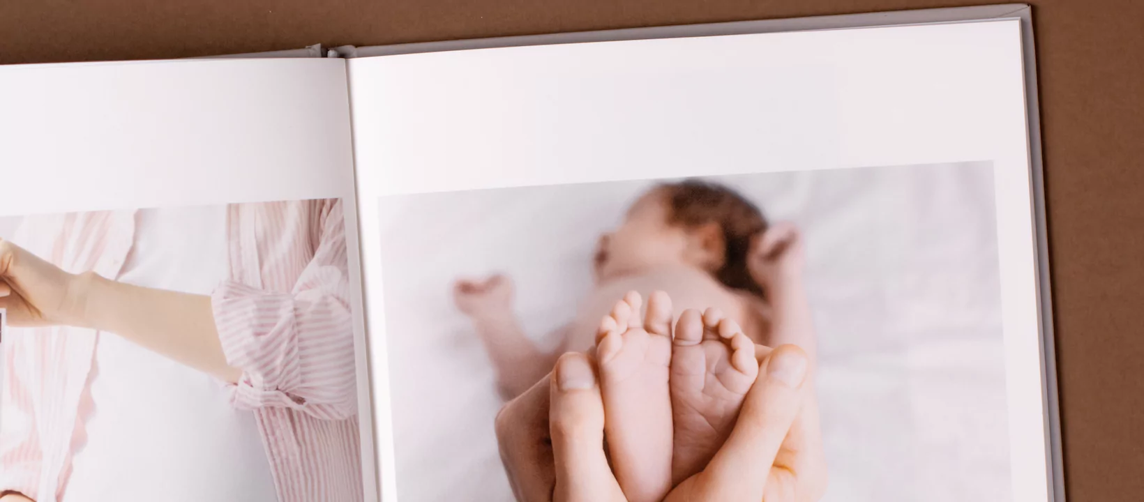
A strong photobook isn’t just about sticking pictures on pages. It starts with how well the layout allows you to tell a story. When you’re flipping through, each page should feel connected to the next. Good layouts don’t distract. They guide your eye naturally and help you relive a moment in the right sequence. Whether it’s a family trip, a milestone event or a project you’ve put hours into, the layout must support that flow.
Materials also play a big role in separating a basic book from one that feels worth keeping. You’ll immediately notice the difference when the paper feels firm and the colours hold their shape across the page. Good photobooks are made using stock that can carry weight without buckling or fading with time. Combined with quality finishes like matte or gloss, you end up with images that pop without feeling over-processed.
Finally, a solid photobook has to hold together. Cheap bindings fall apart after a few months of handling. A great book keeps its shape even after being passed around a dinner table more than a few times. The stitching, glue or fold should be able to take strain without giving in. That kind of durability makes the book more than a printout. It becomes something you can hand down or keep on a shelf without worrying it’ll fall to pieces. Here are 3 albums types to consider.
Sizes and dimensions that work for most albums
Photobooks come in different shapes for different needs, and the size you pick should suit the kind of photos you’re printing. If you’re working with Instagram-style images or phone shots, square formats are ideal. They don’t distort the picture, and they make it easier to keep the composition balanced. A square layout is also neat and sits well on smaller shelves.
A4 landscape books photobooks are the go-to when you want a traditional feel. They’re great for formal events like graduations, weddings, or portfolios. The open page format sits beautiful as the pages give it weight when open. It’s also a size that doesn’t overwhelm if you’re including lots of text alongside the images.
Then there are panoramic spreads. These wide layouts are made for landscape photos or shots with lots of detail. They’re great for weddings or If you’ve done a road trip or have scenery that deserves the full width of the page, this is the best fit. Nothing beats opening up a double-page panoramic view that fills the whole spread. Take a look at these legacy albums.
Cover materials that protect keepsakes
Your choice of cover sets the tone before the book is even opened. Hardcover photobooks offer bright, affordable personalisation. These are ideal for keepsakes like weddings or baby albums. They are well-made and long lasting. For more insight into how hardcovers help preserve quality, you can take a look at these hardcover photobooks photobooks which showcase several practical examples of what’s possible including upgrading to a leather cover.
Then there’s leather, linen or canvas-wrapped covers. photobook prices These give a more tactile feel. They don’t just look good on a coffee table but also offer extra texture that softens the tone of the book. These covers are less about polish and more about character. They often appeal to people who want their book to feel warm or handmade.
If you’re not looking for something too serious, softcovers Softcover Photobooks do the job for casual projects. These are ideal for lighter topics, like holidays or weekend events. They’re easier to carry, quicker to produce, and cost less. Softcover formats are better suited to photobooks that won’t be handled too often or that are created in bulk. A closer look at these softcover photobooks can give you an idea of what to expect in terms of flexibility and feel.
Binding styles and their pros and cons
Binding style decides not only how your book looks but how long it lasts. A legacy album Watch the Video should be butterfly bound and strongly forged with leather, canvas or linen-bound cover. These books open completely flat, which means no curve swallows part of your photo. It’s perfect for panoramic shots and design-heavy layouts. You don’t lose any detail in the middle, and the viewing experience is seamless.
Hardcover bound books are the middle ground. Their spine is reinforced and strong. Like any quality book, they can be long lasting if treated with care. They give a clean edge and look neat on a shelf.
Softcover photobooks are usually saddle-stiched (staple-bound) and usually come with ‘self-cover’ where the cover is made from the same paper as the pages, or you can often upgrade the cover to thicker card for a little more durability. These books are good for time-bound events, rather than family heirloom keepsakes. Handling will degrade them over time, but again, it depends on how they are treated. This video demonstrates softcover binding.
Paper finishes and how they affect colour
Not all paper finishes are equal, especially when it comes to how they carry colour. Photographic paper pages give your images a crisp, bold look. They work best for high contrast photos where you want the colours to pop. But keep in mind they can reflect light and show fingerprints easily, and should be handled with care.
Silk paper, with a slightly more matte finish tones things down. They absorb more light, which reduces glare and gives a more subtle presentation. Silk paper is well-priced, affordable and the feel under your fingers is smoother too, which adds to the experience of flipping through without distraction.
Printing methods that keep colours vivid
There are different ways of printing a photobook, and the method used has a direct effect on how your images turn out. Digital printing is one of the most common for short runs. It’s cost-effective and works well for books that are printed in small quantities. It’s highly affordable and the colour quality is consistent and can handle a range of paper types.
Silver halide printing is often used for high-end albums. It’s the same technique used in photo labs, producing rich colours and deep blacks. If your book is all about visual impact, this is the method to go for. The tones are smooth, and the images hold up better over time without fading. Check out this range of photo books made with Silver halide printing.
Design software features that save time
The software used to build your photobook can either make the process smooth or painful. The best options let you drag and drop your images, choose from pre-set layouts, and shuffle things around easily. If it takes you longer to learn the tool than to build the book, you’re using the wrong one.
Auto-fill features are also helpful when dealing with large batches of photos. Instead of dragging in one image at a time, the software arranges your shots by date or ascending numbers according to the order you want them to appear in the book. That means less manual work and less chance of missing something. You can always go back and fine-tune the layout once the basics are in place. Here's a demonstration of auto-fill
However, if you want to use design suite software, the trick is to begin by setting up your page to the dimensions that match the product and company you want to print with. Most photobook companies will have a HC calculator: page on their website where page dimensions are available for all their products as well as youtube videos on their channel to help guide you through the process. The last thing you want to is to get to the end of a lengthy design process and find you need to trim off an important area of your book because it doesn’t fit in the dimension of your printing house. But by setting up your page size right as step one you can avoid this frustration.
Themes and occasions suited to each style
Not every photobook has to be a family archive. Some of the best books are built around specific themes. Weddings are an obvious choice, and for that, something like a high-end album with thicker paper and high end finishes is ideal. A good example of this is what you’ll find under ultimate albums, which are designed to hold important memories with care and style.
Many photobook companies offer themed books. baby's first year These have been curated by a graphic designer on a specific style and theme such as baby, wedding, travel, yearbook, in memorium, etc. Themes not only make your book look good, but help save time as you don’t need to conceptualise your artwork - it’s already there waiting for you to choose one you like and fill it with your own memories. Here's a demonstration of photobook themes.
Storage factors that extend lifespan
You should also think about storage. Humidity can ruin a book fast, causing your special pages to stick together. Store them in a cool, dry space. Keep them upright if possible and avoid pressing too many together. If your book comes with a box or sleeve, use it. If you live in a super humid book placing tissue paper between the pages - particularly if you book is made from the silver halide process, can be a good preventative step.
Budget ranges and what you get at each tier
If you’re looking to create something quick and simple, entry-level photobooks are the place to start. These usually include softcover photobooks, basic paper, and limited layout options. They’re cost-effective and fine for casual use. They just won’t last forever. Here's a demo of a softcover.
Mid-tier photobooks give you a little more to work with. These might include hardcover options, better quality prints and access to upgraded design tools. They’re best for people who want something that looks polished but aren’t printing in bulk.
Top-end books cost more, but they bring better finishes, thicker paper, professional colour management, and premium packaging. These are built to be handled and displayed. If your photos mark a once-off occasion like a wedding or special birthday, it’s worth going all in. Here's a demonstration of a top-end book.
Ordering tips to avoid disappointment
Don’t rush through the final steps. Bleed margins are there for a reason. They help ensure nothing gets cut off during printing. Always double-check that important parts of your image aren’t sitting too close to the edge.
Resolution matters. Just because an image looks sharp on your phone doesn’t mean it’ll print well. Most services recommend at least 300 dpi for quality results. If you’re unsure, check the preview mode before you confirm. Most photobook software will warn you if your picture is too pixelated.
Always review the proof. This might be a digital version or a printed sample, but it’s worth the extra time. You don’t want to spot typos, blurred photos or bad alignment after you’ve spent money printing multiple copies. Most photobook companies have a preview screen where you can view your final copy easily and spot and changes you might want to make.
Creating a photobook when you shoot on a phone
Most people shoot on their phones now, but that doesn’t mean you can’t make a high-quality book. The first step is to make sure your photos are backed up in full resolution. Avoid compressing them by uploading through apps that downscale the file.
Next, give your images a once-over. Adjust contrast and exposure to suit print, not just screen. The way your picture appears on your computer screen is differnt to how your photobook will appear in print. Remember your computer is backlit, your book isn’t. Edit for lightness if needed to avoid colours appearing flat on paper. Edit with printing in mind.
Once that’s done, sync the images to your design tool or cloud storage. That way, if you switch between devices or need to come back later, you won’t lose your place. This makes the process faster and helps you spot gaps or duplicates in your layout.
Mistakes to dodge during layout
One of the most common mistakes is cramming too many images on a single page. Less is more. Give your photos breathing space so the eye has somewhere to rest. Busy pages don’t hold attention. They feel messy and rushed.
Another error is mixing too many fonts or colours. Keep it clean. Use no more than two fonts throughout the book. This builds consistency and helps the captions feel part of the design, not an afterthought.
Don’t forget about how spreads interact. A photo that runs across two pages needs to be centred properly, or else the focus can end up stuck in the fold. Always check how your images align when viewed side by side.
Bringing a story together with captions and titles
Captions make a big difference when used well. They don’t need to be long, just clear. A simple date or place name helps orient the viewer and turns a collection of pictures into a timeline.
Don’t put text too close to the spine or edge. It risks getting lost in the curve or trimmed during print. Place it consistently and use a font size that remains readable across the whole book.
When choosing fonts, think about tone. A clean sans-serif feels modern, while a serif font can feel more classic. Pick one that matches the occasion and stick with it.
Final checks before you click print
You’ve come this far, don’t cut corners now. Read every caption again. A single spelling mistake can throw off an entire page. Get someone else to look too, if possible. Fresh eyes catch more.
Use the preview function and go through every spread. Make sure images line up, text is legible, and nothing looks like an afterthought. Look at spacing, margins, and flow from one page to the next.
Lastly, double-check your delivery details. Printing takes time, and if there’s a mistake in your address or choice of delivery method, you’ll lose more than just a few days.